


Background: Hello! is a Canadian entertainment magazine often
focusing on the royal family, National Geographic produces in depth articles
about fascinating humans, animals, science, and nature, and Mark is an a non-scholarly
creative architecture magazine.
After reading background of each magazine, would you have
been able to tell that is what the logo represents?\
Hello! often markets their Canadian roots to stand-out
against the American entertainment magazines on Canadian shelves. Their logo
reminds viewers by its shape being representative of a flag with red on the
outside and white on the inside. Remind you of anything? To even further merge their Canadian-themed branding
to the consistent royal family content, Canada was founded by England. Hello! displays
high contrast compared to the National Geographic and Mark. It uses the most
colour, and it uses the colour red – a very energetic, attention-grabbing colour.
The font-type is Futura bold, a very simple heavy font to inform that this
magazine is non-scholarly. The exclamation mark at the end of “Hello!” adds excitement
and definiteness to the statement, telling the reader that this magazine will
be interesting and fun, but will also get to the point.
National Geographic uses shape, colour, and font to share
what type of content is within to an international audience. National Geographic
is the only magazine of these three to incorporate shape within their logo. The
simple rectangle mimics the shape of a photo frame, and each issued cover is
bordered by the yellow rectangle.
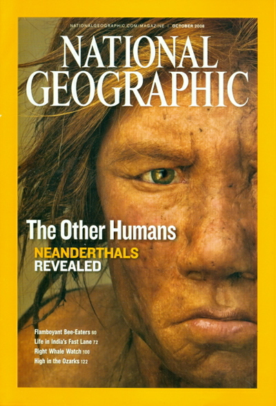
The logo’s text is aligned vertically to fit within the rectangle
insuring that this magazine shares a portrait into someone’s life. The font is
a custom type known as “NatGeo SemiBold” and is not available to the public,
making a statement that the content within had to be discovered and is
exclusive.
Based off of their logo, Mark magazine is obviously a creative,
artsy, and inspiring magazine.
The Mark logo comes in various colours depending on the cover’s
content but is most often shown in black.


The biggest difference in the Mark logo compared to Hello!
and National Geographic is its use of type. The designers have kept the word “Mark”
upright but have elongated and slanted all of the letter endings to add visual
intensity and visual imagery to mimic a skyline. A skyline always has a similar
base but the tips of buildings is what adds variety and interest. This is very
similar to the logo - base of the letters are identical but the word “Mark”
emerges adding that variety and visual intensity. For a magazine which content
is architectural based this logo is well representative.
There are many other comparisons available for discussion such
as magazine covers vs. content and how the logo is used within the cover.
Sources:
No comments:
Post a Comment