Wednesday 18 June 2014

Class Thoughts

Dear readers, this blog is for the Advanced Storytelling class at Carleton University students. This following report shares my thoughts from and recommendations for the class.

When thinking of the title, "Advanced Storytelling" you may expect the class would focus on teaching story and character development and ways to captivate and educate an audience through stories. This class being paired with a story-based program  like Journalism deepened my expectations about the course's content. Instead it was much different.

During our first class, it became clear that the course’s title was deceiving and that I would not be learning what I came there to learn. Trying to keep an open-mind I stayed with the class - it was only 6 weeks after all.

My program's title is "Interactive Multimedia and Design" and it consists of half code and half computer based design. It is a four-year University program and by the end of third year we are capable of producing a wide range of pieces. As we have had a lot of exposure to various forms of media by this point in our program, we know what we like and what we don't like. In my program, senior students choose what projects they would like to pursue. In this class, there was no choice and the project was assigned.  We were forced to do web based project.

There were other people in the class who had great expertise in web, and even earned a living from it. Now I am grateful person and often don't complain about other people's abilities, but  as a student with limited web experience, I was put at a disadvantage when being judged against students who've focused all of their efforts, projects, and work on web-design since the beginning of the program. The groups who produced the best projects in the class were composed of people who had done web design professionally. This was the most significant and stress producing downfall for this class.

Looking back, I would allow the student's to produce a project in whatever medium they choose, it would simply be a requirement to have both a design and journalism portion. Trying to remain enthusiastic and engaged  with the class, I tried to learn as much from the Journalism students and Kanina (our professor) as I could.

What they knew and what they were doing interested me much more than building another website. As an extrovert in a program full of introverts, it was fun to see the more extroverted journalism students going out and talking to strangers to learn more about them and their history. I even went with one to a karaoke night, hosted by a ‘drag queen’ in Chinatown.  I observed how the journalism students asked creative questions to elicit great responses. Although that night was fun as is, we stayed there for four hours in hopes to get information but the drag queen just asked us to Facebook her in the morning instead. In regards to the class, I learned most about Journalism from Kanina and the other students, instead of ‘Advanced Storytelling.’

Being in a collaborative environment is very important. It expands your knowledge immensely about the world around you. The only downfall is that sometimes you are going to be learning things you already know. In this class, I already knew about 75% of the information I was exposed to both in and out of the classroom. For a student who is paying $790 dollars for 6-week class that is a hard pill to swallow.

I imagine it would take a great deal of effort and organization to get a collaborative class to execute well. It seems that for what the profs wanted to achieve, it hit the mark. Yet, for me I leave feeling a bit frustrated, but glad I took the class. These comments above are simply suggestions to make the class more appealing to an IMD student.

Thursday 5 June 2014

Media Objectivity and Subjectivity in Russian Olympics

Around the globe three billion people tuned in to watch the Sochi Olympics opening ceremony. But, the 43 million living in Russia saw a different ceremony. As the famous Olympic rings were turning from snowflakes into circles a missed cue from a stage manager caused one snow flake to not transform (image below).


When the malfunction was aware of the Russian media cut away from the real footage to show a rehearsal where all the rings fully developed. This is not the only incident where the media was skewed to show only a positive image to Russian citizens during the games. According to an article “Obstructed view: how Russia distorts the Olympics” by Amar Toor of The Verge, a writer wrote three articles and sent them to her editor in Moscow (One of a journalist being arrested, another of poor water facilities at a complex for evicted residents, and one about worrisome weather). All three were turned down because it did not portray Russia positively.
In opposition to Russia’s portrayal of everything great, NBC has been criticized for editing its footage to highlight all of the negative happenings at the games.

The games have always had controversy surrounding them but changing the ‘raw footage’ for what people base their opinions on sets a biased standard. Whether the edited footage is to have a positive or negative effect, one is still manipulating someone else without them knowing.

When Russian President Vladimir Putin was questioned about the media's approach he continued to support the decision claiming that it was and still is in best interest for the nation. Reversely western media emphasizing the Olympic's mishaps to portray Russia as an inadequate country mimics the political issues during and following the Olympics.

Fact is this blog post could go on and on why both parties have done what they have done. But instead, this will discuss how this influences views objectively and subjectively.  Objectivity is when something is viewed with a unbiased perspective, and subjectivity is when something is influenced by a person’s beliefs.

In this case viewers around the globe believe what they were watching was objective, especially considering most of the footage is live. The footage itself may be objective but the reporter's audio, and clips chosen are what add a subjective layer. By editing the feed on-demand of the Opening Ceremonies for Russian viewers, it changes what Russian's know as the truth. They now pride themselves thinking the opening ceremonies were incredible without even one flaw - not knowing that they have been lied to. Telling selected portions of a story is biased because it is only telling one view. This is the same for the Olympics. Russia chose to only show the glorified view, and NBC a negative one.

The extreme step the Russian media took in hiding their struggles to their own citizens caused them to be the first Olympic hosts to clip away from the live footage to recorded during the opening ceremonies. 


Sources:

Interesting interactive media highlighting all the negative steps Russia took to prepare for the Olympics: http://sochi.fbk.info/en/

Sunday 25 May 2014

Thoughts on Mandala's Walk Video

Below are technical thoughts from the Mandela's Walk video found here: http://www.mandelaswalk.com/

Mandela’s Walk opens with a beautiful video to entice readers while putting them into the correct mindset. The video and audio separately does not provide a direct answer about the article content, but together it can be fairly obvious to someone who knows of Mandela.

A key item to decide when embedding an introduction media piece into a website is to determine if the title should be shown. Mandela’s Walk chose not to show a title and I think this was very clever of them. It makes you question what you are going to watch, and lets you try to piece together an answer from what the video provides.

When the first lady walks into frame she places the doll on the ground, mimicking the process of a burial by placing something special on a lost one. Once someone else is seen walking behind her it takes away the focus from these people and instead to the reason they are bringing objects to this location. All of the objects brought have some kind of resemblance to Mandela including barb wire, and picket signs – again hinting what the article will be about.

The cinematography and editing in this piece is stunning. For each person who entered the scene there was a shot of them placing something on the ground, and one of their blank face. Although this could seem repetitive on paper, it is done in a way to use receptiveness to its advantage by hinting that the article’s subject has affected many different people.

The audio consists solely of background music and a narrator, and has removed all of the sounds from the recorded footage. Doing this keeps the piece more simplistic but it does further separate the video and audio from each other.

The audio and imagery work brilliantly together. When the narrator says “Many roads will present themselves, but he must take the one that few others would follow” there is an image of a young boy placing down a clean white dress shirt that is obviously too big for him suggesting a path for his future. There are many examples like this one throughout but the most striking is at the end. The camera zooms out from the art while the narrator says “would not change a single footstep” and on the edge of the frame the feet kicking up as last person’s walks away is seen.

If I were the director on this piece I would have shown more environment shots (to lessen disorientation of an international audience), added the title or a phrase of what the topic is at the end (to familiarize people who may not know Mandela’s story), added sounds of objects being placed, and sounds of the first and last person’s footsteps.

With our project in mind, I would like our introduction video to not directly say what the website content is for – to keep the audience guessing.

Monday 19 May 2014

How a Magazine Logo Defines it’s Content

 Magazines are a media source of information, some for a casual read and others require a little more thought. Below are three different magazine logos followed by insight as to how their brandings compare to another.


Background: Hello! is a Canadian entertainment magazine often focusing on the royal family, National Geographic produces in depth articles about fascinating humans, animals, science, and nature, and Mark is an a non-scholarly creative architecture magazine.

After reading background of each magazine, would you have been able to tell that is what the logo represents?\

Hello! often markets their Canadian roots to stand-out against the American entertainment magazines on Canadian shelves. Their logo reminds viewers by its shape being representative of a flag with red on the outside and white on the inside. Remind you of anything?  To even further merge their Canadian-themed branding to the consistent royal family content, Canada was founded by England. Hello! displays high contrast compared to the National Geographic and Mark. It uses the most colour, and it uses the colour red – a very energetic, attention-grabbing colour. The font-type is Futura bold, a very simple heavy font to inform that this magazine is non-scholarly. The exclamation mark at the end of “Hello!” adds excitement and definiteness to the statement, telling the reader that this magazine will be interesting and fun, but will also get to the point.

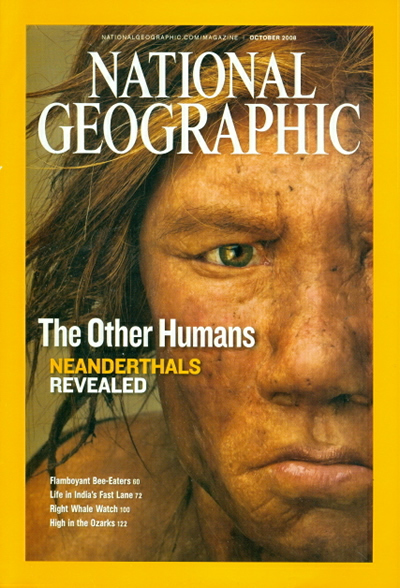
National Geographic uses shape, colour, and font to share what type of content is within to an international audience. National Geographic is the only magazine of these three to incorporate shape within their logo. The simple rectangle mimics the shape of a photo frame, and each issued cover is bordered by the yellow rectangle.

The logo’s text is aligned vertically to fit within the rectangle insuring that this magazine shares a portrait into someone’s life. The font is a custom type known as “NatGeo SemiBold” and is not available to the public, making a statement that the content within had to be discovered and is exclusive.

Based off of their logo, Mark magazine is obviously a creative, artsy, and inspiring magazine.
The Mark logo comes in various colours depending on the cover’s content but is most often shown in black.


The biggest difference in the Mark logo compared to Hello! and National Geographic is its use of type. The designers have kept the word “Mark” upright but have elongated and slanted all of the letter endings to add visual intensity and visual imagery to mimic a skyline. A skyline always has a similar base but the tips of buildings is what adds variety and interest. This is very similar to the logo - base of the letters are identical but the word “Mark” emerges adding that variety and visual intensity. For a magazine which content is architectural based this logo is well representative.


There are many other comparisons available for discussion such as magazine covers vs. content and how the logo is used within the cover.

Sources: