Sunday 25 May 2014

Thoughts on Mandala's Walk Video

Below are technical thoughts from the Mandela's Walk video found here: http://www.mandelaswalk.com/

Mandela’s Walk opens with a beautiful video to entice readers while putting them into the correct mindset. The video and audio separately does not provide a direct answer about the article content, but together it can be fairly obvious to someone who knows of Mandela.

A key item to decide when embedding an introduction media piece into a website is to determine if the title should be shown. Mandela’s Walk chose not to show a title and I think this was very clever of them. It makes you question what you are going to watch, and lets you try to piece together an answer from what the video provides.

When the first lady walks into frame she places the doll on the ground, mimicking the process of a burial by placing something special on a lost one. Once someone else is seen walking behind her it takes away the focus from these people and instead to the reason they are bringing objects to this location. All of the objects brought have some kind of resemblance to Mandela including barb wire, and picket signs – again hinting what the article will be about.

The cinematography and editing in this piece is stunning. For each person who entered the scene there was a shot of them placing something on the ground, and one of their blank face. Although this could seem repetitive on paper, it is done in a way to use receptiveness to its advantage by hinting that the article’s subject has affected many different people.

The audio consists solely of background music and a narrator, and has removed all of the sounds from the recorded footage. Doing this keeps the piece more simplistic but it does further separate the video and audio from each other.

The audio and imagery work brilliantly together. When the narrator says “Many roads will present themselves, but he must take the one that few others would follow” there is an image of a young boy placing down a clean white dress shirt that is obviously too big for him suggesting a path for his future. There are many examples like this one throughout but the most striking is at the end. The camera zooms out from the art while the narrator says “would not change a single footstep” and on the edge of the frame the feet kicking up as last person’s walks away is seen.

If I were the director on this piece I would have shown more environment shots (to lessen disorientation of an international audience), added the title or a phrase of what the topic is at the end (to familiarize people who may not know Mandela’s story), added sounds of objects being placed, and sounds of the first and last person’s footsteps.

With our project in mind, I would like our introduction video to not directly say what the website content is for – to keep the audience guessing.

Monday 19 May 2014

How a Magazine Logo Defines it’s Content

 Magazines are a media source of information, some for a casual read and others require a little more thought. Below are three different magazine logos followed by insight as to how their brandings compare to another.


Background: Hello! is a Canadian entertainment magazine often focusing on the royal family, National Geographic produces in depth articles about fascinating humans, animals, science, and nature, and Mark is an a non-scholarly creative architecture magazine.

After reading background of each magazine, would you have been able to tell that is what the logo represents?\

Hello! often markets their Canadian roots to stand-out against the American entertainment magazines on Canadian shelves. Their logo reminds viewers by its shape being representative of a flag with red on the outside and white on the inside. Remind you of anything?  To even further merge their Canadian-themed branding to the consistent royal family content, Canada was founded by England. Hello! displays high contrast compared to the National Geographic and Mark. It uses the most colour, and it uses the colour red – a very energetic, attention-grabbing colour. The font-type is Futura bold, a very simple heavy font to inform that this magazine is non-scholarly. The exclamation mark at the end of “Hello!” adds excitement and definiteness to the statement, telling the reader that this magazine will be interesting and fun, but will also get to the point.

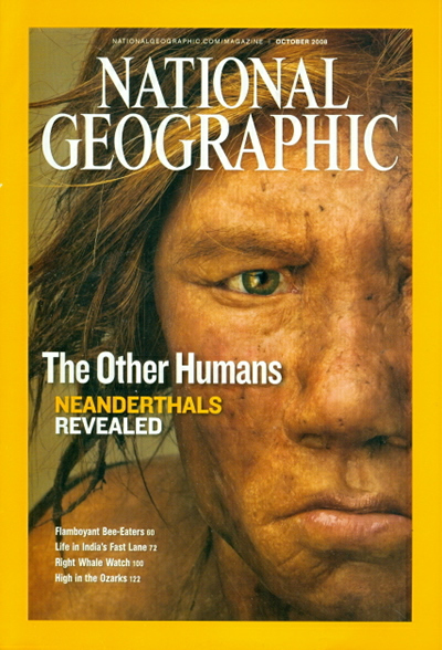
National Geographic uses shape, colour, and font to share what type of content is within to an international audience. National Geographic is the only magazine of these three to incorporate shape within their logo. The simple rectangle mimics the shape of a photo frame, and each issued cover is bordered by the yellow rectangle.

The logo’s text is aligned vertically to fit within the rectangle insuring that this magazine shares a portrait into someone’s life. The font is a custom type known as “NatGeo SemiBold” and is not available to the public, making a statement that the content within had to be discovered and is exclusive.

Based off of their logo, Mark magazine is obviously a creative, artsy, and inspiring magazine.
The Mark logo comes in various colours depending on the cover’s content but is most often shown in black.


The biggest difference in the Mark logo compared to Hello! and National Geographic is its use of type. The designers have kept the word “Mark” upright but have elongated and slanted all of the letter endings to add visual intensity and visual imagery to mimic a skyline. A skyline always has a similar base but the tips of buildings is what adds variety and interest. This is very similar to the logo - base of the letters are identical but the word “Mark” emerges adding that variety and visual intensity. For a magazine which content is architectural based this logo is well representative.


There are many other comparisons available for discussion such as magazine covers vs. content and how the logo is used within the cover.

Sources: